ERŞAN KUNERİ v YEŞİLÇAM
A Cinematographic Oddity
Although Erşan Kuneri appears to be a satirical series about a caricatured filmmaker producing parody films in the 1980s, Cem Yılmaz emphasized the production’s attention to visual and design details during its marketing campaign. The cast also repeatedly expressed admiration for the set design and costume work. In short, both Cem Yılmaz and the crew frequently claimed that the show was a faithful recreation of 1980s Turkish cinema.
However, there is one crucial aspect missing from these discussions—something Yılmaz never addressed in interviews: cinematography.
After all, Erşan Kuneri’s fictional films are supposed to have been made in the 1980s. Therefore, they should also look as if they were shot in that era. We’ll return to the aperture issue soon, but first, let’s outline a few of the characteristic cinematographic traits of classic Hollywood and Yeşilçam films (Yeşilçam being the Turkish equivalent of Hollywood during the mid-20th century).
Shot on 35mm Film

Kodak Eastman 5247, 35mm color negative film stock.
Perhaps one of the most defining characteristics of what we now call “cinema.” Nearly every film etched into collective memory was shot on 35mm film stock—which, compared to its predecessors (16mm or Super 8mm), offered sharper resolution (roughly equivalent to 4K–6K), higher image fidelity, and a wider aspect ratio.
Yet, in the case of Turkish cinema, the situation was complicated. Documentation was sparse, and resources were limited. According to L. Yılmazok’s Eurimages and Turkish Cinema: History, Identity, Culture (p. 56), by the late 1970s, escalating political tensions, economic hardship, and television’s affordability made 16 mm and 8 mm increasingly common. In 1979 alone, out of 195 films released, 131 were low-budget sex comedies shot on 16 mm.
This is exactly where Erşan Kuneri’s fictional history begins. One could therefore ask:
“Shouldn’t Erşan Kuneri’s films have been shot on 16 mm?”
That would have meant softer depth of field, lower image quality, and perhaps expired film stock—authentic to the period. A counterargument might say that the series takes place after Turkey’s 1980 military coup, when the so-called “Sex Film Era” was over; hence, the protagonist’s movies are no longer true to that genre but only carry its traces.
Still, if one is going to recreate a 1980s director—his scripts, costumes, and set environments—why not also emulate his film format? Even if 16 mm was impractical for Netflix’s modern distribution, 35 mm remains a standard and could have been simulated.
Unfortunately, production notes on what cameras or lenses were used are unavailable. Behind-the-scenes footage reveals that the series was shot in LOG format, later processed with a modern color-grading workflow. The production could have created a custom film emulation LUT to approximate 35 mm texture—but instead relied on a superficial film-grain overlay and vignette.
That alone undercuts the meticulousness Cem Yılmaz claimed. Moreover, since Erşan Kuneri is portrayed as a “B-movie” director, filming his parodies with high-end digital cinematography contradicts the entire narrative mechanic. The result: a show that uses contemporary cinematographic precision merely as a backdrop for retro jokes and costumes—thereby undermining its own concept.
Depth of Field: The Use of Wide Apertures
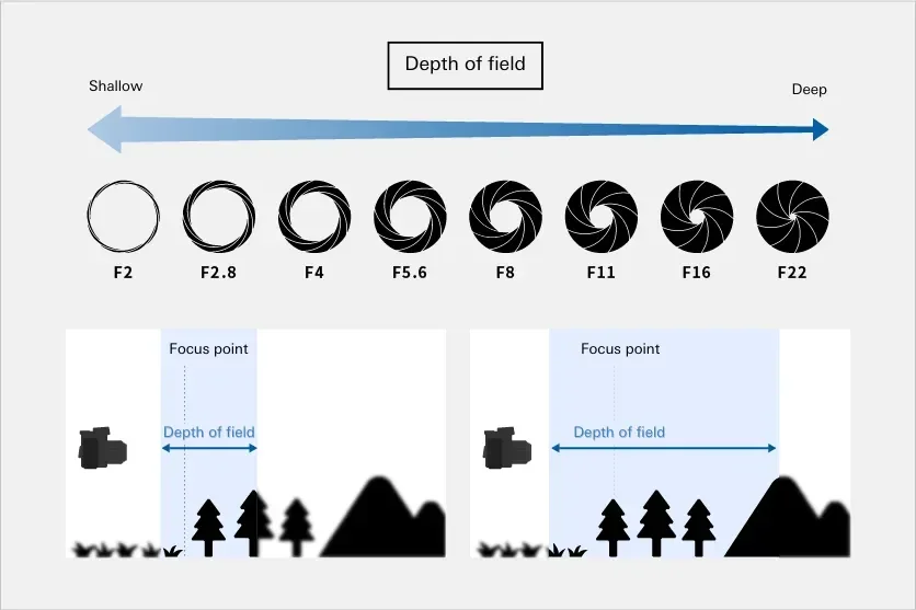
Diagram showing aperture size levels.
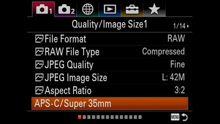
Sony A7IV Menu
In classical cinema, the shallow-focus craze we see today didn’t exist. Depth of field depended on film stock, lens choice, and lighting conditions.
For instance, shooting today with a Sony A7 IV, its sensor is larger than 35 mm film—closer to a digital VistaVision format. If one wanted a vintage 35 mm look, one would crop to Super 35 mode and stop down the aperture.
In classical Hollywood or Yeşilçam, keeping the entire mise-en-scène in focus was a priority. The goal was to ensure that every character and object within the frame was visible and contextually legible. Take this frame from Hababam Sınıfı (1975): we can clearly see the protagonist, the supporting characters, and even the equations on the blackboard behind them.

Hababam Sınıfı (1975)
DP: Hüseyin Özşahin

Behind the Scenes Photo from The Life and Movies of Erşan Kuneri Season 2
While writing this part, I realized that some of the things I’ve said—and will say—about aperture might be misunderstood. So it’s worth unpacking a bit.
For instance, when I describe T2.8 as a “very wide aperture,” that might sound questionable at first. But if we don’t forget the context we established earlier, that doubt quickly dissolves.
Let’s consider a likely objection:
“T2.8 is a common setting preferred by many cinematographers. And T-stop, unlike F-stop, is an absolute value that reflects the actual light transmission of the lens, regardless of camera format. So why should sensor size or focal length have anything to do with it?”
That’s a fair question. You could even say, “Both classical Hollywood films and many modern productions were shot in formats close to Super 35. Then why does everything appear sharper and more in focus in older films, while modern ones look shallower?”
The answer lies here:
Yes, the T-stop value remains constant—but depth of field does not. It varies drastically depending on the sensor or film format and the technological limitations of the era.
And that, precisely, is where the key difference between Erşan Kuneri and Yeşilçam lies.
I’ll discuss exposure and contrast in the next section, but before we get there, it’s important to understand why wide apertures weren’t used as commonly back then. To clarify that, I’ll touch on three main points.
1. Technical Limitations and Aesthetic Preferences of the Era

A cinematographic comparison between the “Kuru Murat” episode of The Life and Movies of Erşan Kuneri and the film Battal Gazi’nin Oğlu (Son of Battal Gazi).
In fact, during the 1970s and 1980s, DPs tended to shoot with narrower apertures—especially for exterior scenes, they would often work around T8–T11. Why? Because film stocks of that era typically ranged between ISO 50 and 100 ASA. Massive HMI and tungsten lights were used on set, and stopping down the lens became both a necessity for proper exposure and an aesthetic choice characteristic of the period.
Moreover, lenses of that time produced soft corners, low contrast, and optical imperfections when shot wide open. By stopping down, these flaws would diminish, the entire scene would appear sharper, and the focus puller would have a wider margin of safety. Considering that focus pullers and cinematographers of that era didn’t have the luxury of on-set monitors, shooting wide open was a major risk. In Yeşilçam, it was even riskier than in Hollywood—a point that director Çetin İnanç clearly conveys in the documentary Remake, Remix, Rip-Off (Cem Kaya, 2014). İnanç mentions that while a standard Hollywood film would typically use around 250 film rolls, a Yeşilçam production often had to finish a film with just 25–30 rolls. Any director who went beyond 30 rolls would likely never be hired again.
Similarly, in Yavuz Turgul’s Aşk Filmlerinin Unutulmaz Yönetmeni (1990), the “director” character shoots the final scene knowing there won’t be a second take. These examples give a vivid insight into the kind of limitations Yeşilçam operated under. So, even if a Yeşilçam DP wanted to shoot at T2.8, doing so would have been like gambling with the limited film stock they had.

An article titled “The Cinematography of Wes Anderson and Robert Yeoman”
As another example, this article discusses why Wes Anderson’s cinematographer, Robert Yeoman, prefers a deeper focus style compared to other modern DPs. It mentions that Yeoman often shoots Wes Anderson’s outdoor scenes at around T11, and the widest he goes is T4.
I’m giving this example because this choice is one of the major elements that create Wes Anderson’s retro aesthetic. You might think Anderson achieves that nostalgic look mostly through production design and color, but depth of field is actually one of the most important factors reinforcing that sense of nostalgia.
2. The Effect of Sensor/Film Format on Depth of Field

A Study by VMI Comparing Aperture and Focal Length Across Sensor/Film Formats
https://vmi.tv/blog/learn-help/guide-to-sensor-sizes-and-lens-formats/
In the comparison shown in this article, you can see how depth of field behaves differently depending on the sensor/film format, even though the images are shot with the same aperture. Based on this, we might argue that filming Erşan Kuneri with a Blackmagic Pocket would have been a more faithful adaptation. However, the series seems to have been shot with cameras that have larger sensors. Moreover, the cinematographers for Season 1 and Season 2 were different people.
For instance, let’s compare the Kötü Mal episode from Season 1 and the Kötü Yol episode from Season 2. These are essentially sequels to each other, yet the episode shot by cinematographer Uğur İçbak feels much closer to the Yeşilçam aesthetic. In that episode, the lighting—especially the use of hard light—is reminiscent of classic Yeşilçam films, and intentional imperfections have been added. Hard light helps emulate the contrasty look of classic cinema.
Also, the film stocks of that era didn’t allow for precise white balance adjustments, resulting in frames that often leaned yellow or blue. This issue sometimes arose because cinematographers had to change film rolls before finishing a scene. In Kötü Mal, particularly in the police station scenes, we can see this effect emulated quite successfully. It suggests a solid collaboration between the cinematographer and the colorist.
Likewise, compared to Season 2, the first season has relatively deeper depth of field, which nicely illustrates how cinematographic choices can transform the visual feel of an image. The two episodes may take place at different times within the story, but the point here is that the cinematography never aimed for that level of authenticity to begin with.
As a result, the general visual look of Erşan Kuneri ends up overshadowing these subtle technical distinctions that could have made a significant difference.
A comparison between the “Kötü Mal” and “Kötü Yol” episodes in Erşan Kuneri
Analyzing a Frame from the “Kötü Mal” Episode of Erşan Kuneri (Season 1) Using a Vectorscope
3. Modern Color Grading Habits

A colorist working on color grading in DaVinci Resolve Studio
When talking about colorists, one of the choices that enhances the sharpness of an image and exaggerates depth of field actually lies within color grading itself. As you can imagine, in older films there weren’t advanced color manipulation tools like we have today. The colors, lighting design, camera/lens choice, and film stock were the only areas where you could make adjustments.
But nowadays, many productions are shot in LOG or sometimes even RAW formats. This gives colorists enormous freedom to manipulate color and exposure. Of course, this is also a field where the cinematographer should be involved — but due to modern trends and widespread habits, many colorists now tend to sharpen the image even more by emphasizing the separation between background and foreground.
To achieve this, they often use tools like masks, power windows, depth maps, and color contrast — driven by an obsession to make the subject or character stand out more from the background. These techniques, taught in color grading tutorials and seen in dominant mainstream films, have gradually turned into conventions.
Therefore, when such methods are applied to a film that’s supposed to look like it was shot in the 1980s, they push the footage — which was already not shot with that intention — even further away from that aesthetic. In my opinion, this is one of the main reasons why Erşan Kuneri’s visuals look overly modern.
I hope this section has helped clear up any potential confusion. Now, let’s move on.
My current lens can open up to f/2.8 at its widest aperture; but going back to our earlier experiment — if I wanted to give the impression of an old film, I would stop down the aperture, and if I had an ND filter, I’d lower the exposure to achieve a wider depth of field. In that case, something like f/8 to f/11 would be more appropriate. Of course, one might argue that in Yeşilçam films, due to lighting or film stock limitations, there are frames that appear to be shot with a shallow depth of field, especially in medium shots or close-ups. However, that’s often an optical illusion — because, as mentioned earlier, 16mm or even 35mm film formats are much smaller than the sensor in the camera I’m using right now. Therefore, for example, the depth of field behavior of a lens on 16mm film would be vastly different from that on 35mm. This optical illusion is also reinforced by the choice of focal length, which further contributes to how the perceived depth and separation within the frame are shaped. Ultimately, a supposedly “wide-aperture” scene in a Yeşilçam film would never actually match the openness of the aperture in this shot.

A Frame from Erşan Kuneri Season 2
Let’s move on to another factor that makes Erşan Kuneri behave like a director who has come from the future:
Hard Light and High-Key Contrast Ratio vs. Soft Light and Medium–Low-Key Contrast Ratio

Contrast Ratio, title
Contrast, in the simplest terms, can be defined as opposition or difference. In cinema, contrast can be used to draw the viewer’s attention to something, to add depth, or to convey the necessary atmosphere and dimension within an image. The contrast ratio — technically speaking — is measured by the f-stop difference between the highlights (bright areas) and the shadows (dark areas) within a frame. This is usually evaluated based on how the main subject of that frame is lit.
For instance, in a given scene of a given film, we might say “the contrast ratio is 64:1.” Within a film, this ratio can vary between sequences; but it’s not just about adjusting exposure — it’s also crucial for maintaining visual consistency within the same sequence. Likewise, a cinematographer’s choice of contrast ratio is never arbitrary. And that’s the key point here.
In Hollywood or Yeşilçam comedies — and even in modern Turkish cinema — a high-key contrast ratio is generally preferred, such as 1:1, 2:1, or 4:1. For example, let’s take a look at the film Tosun Paşa (1976) and compare one of its frames to a similar scene from the “Şeker Paşa” episode in Season 2 of Erşan Kuneri.
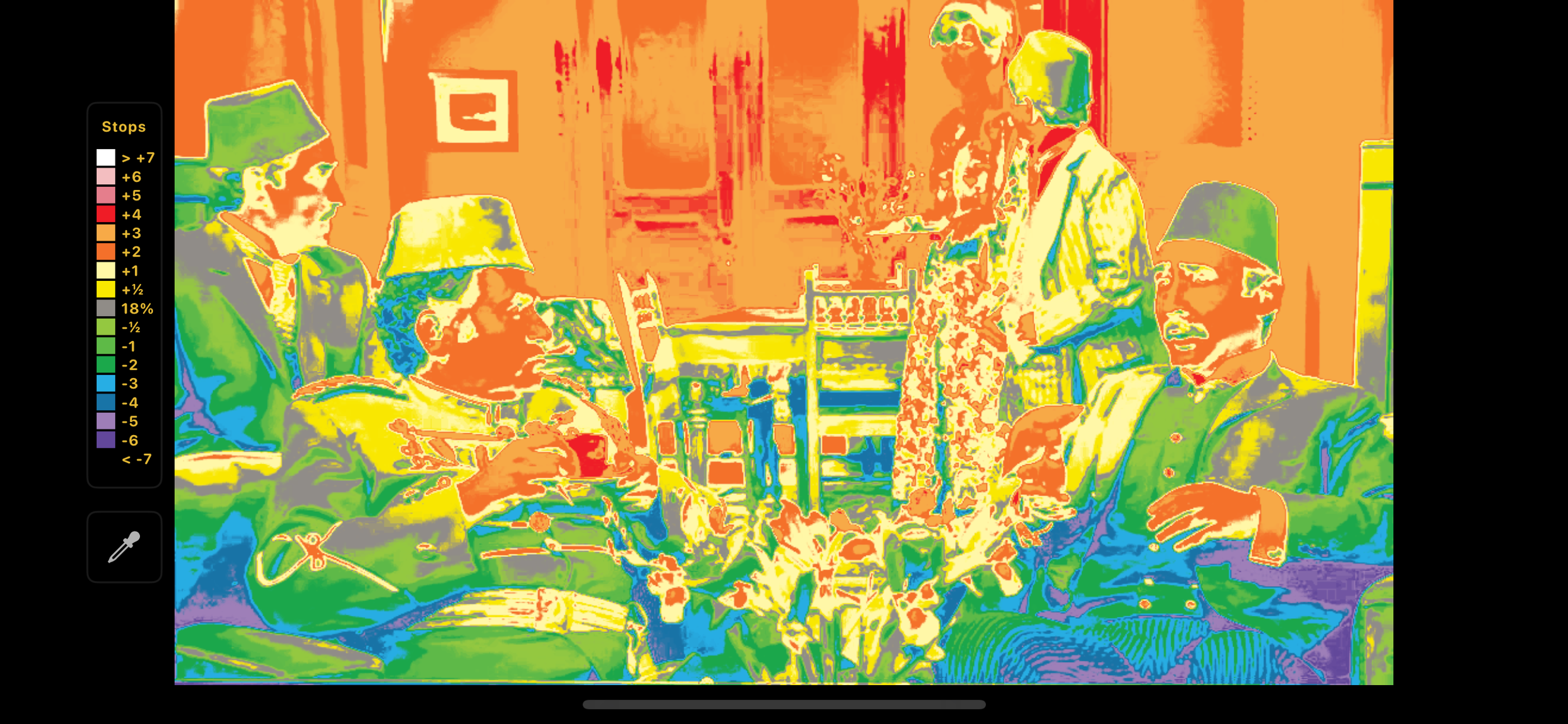
A frame from the Yeşilçam classic Tosun Paşa, analyzed through the EL-Zone system showing exposure values as a color map.
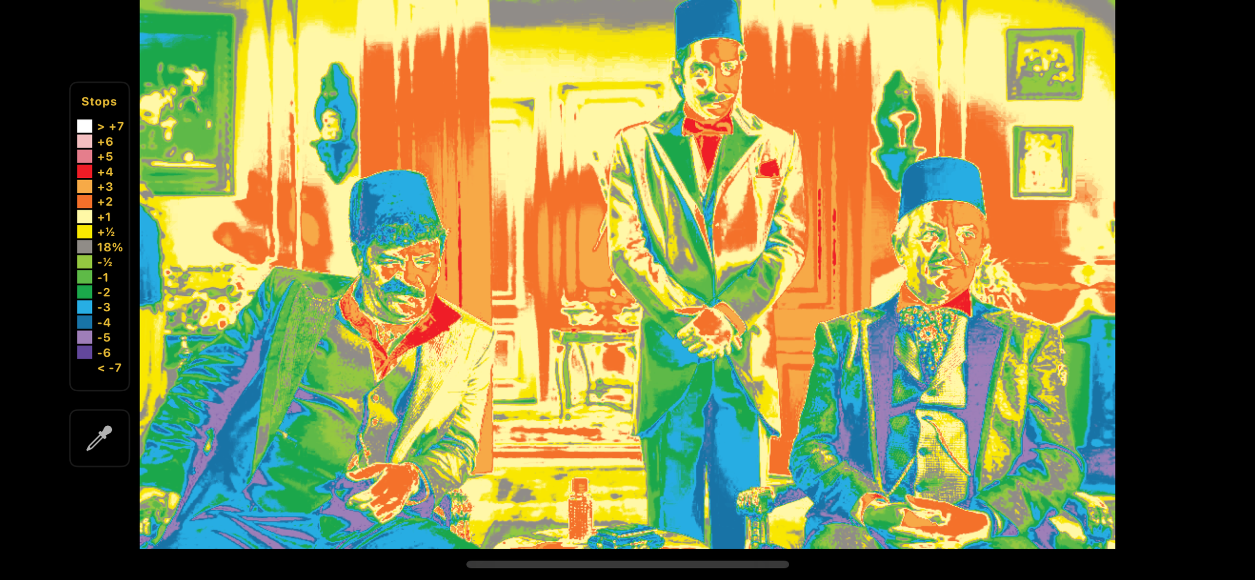
A frame from Erşan Kuneri Season 2, episode “Şeker Paşa,” analyzed through the EL-Zone system showing exposure values as a color map.
Using EL-Zone on a non-LOG format — that is, on the final image — naturally won’t give the most accurate result; however, the purpose of this comparison is to make a difference that’s already visible to the naked eye more meaningful.
As we can see in Tosun Paşa, there’s roughly a 1:1 contrast ratio, and the image is almost overexposed.
On the other hand, in a modern-looking film like Şeker Paşa, there’s a more balanced lighting setup, and the difference between the highlights and shadows on the characters’ faces averages about 1.5 stops — roughly equivalent to a 2.8:1 contrast ratio.
But beyond what seems like a small difference lies a more crucial distinction, in my opinion.
That is, the Şeker Paşa “film” — and, in this sense, all Erşan Kuneri episodes — once again adopts soft and motivated lighting like a modern production.
Yet one of the strongest characteristics of both classic Hollywood and Yeşilçam cinema was the use of hard light.
In other words, in a classic Yeşilçam film, you wouldn’t find softboxes, muslins, or diffused 5500-K daylight sources.
On the contrary, harsh tungsten lights were the norm, and film stocks typically came in only two variants: Tungsten or Daylight.
So if Erşan Kuneri had truly been shot in the 1980s, you wouldn’t be seeing Cem Yılmaz’s skin rendered this softly.
You may have missed this nuance, but it’s precisely for that reason that Tosun Paşa appears to have higher contrast — because contrast ratio isn’t the only factor shaping perceived contrast.
Whether a frame is lit with soft or hard light drastically affects how we feel the contrast.
Even if both sides of a subject are lit at the same f-stop, hard light creates sharper edges and deeper shadows.
Add to that the natural film grain of 35 mm stock, and this punchy, textured image gains yet another layer.
So if, at first glance, you thought Tosun Paşa looked more contrasty, you were right to some extent —
but the real issue is that Şeker Paşa looks nothing like Tosun Paşa.
Conclusion
In summary, if you ask why these choices were made—or rather, why they weren’t made this way—I honestly don’t know. Without speaking directly with Cem Yılmaz or the cinematographer, we’ll probably never know the real reason.
A few not-so-great possibilities come to mind:
First, perhaps Cem Yılmaz and the cinematographer acted on their personal vision instead of what the series actually required in terms of cinematography. In other words, they may have consciously seen making “cheap-looking” B-movies as something to avoid.
Second, maybe such a full-scale recreation would have pushed them out of their comfort zone, extended the production schedule, or even raised questions about audience enjoyment. Perhaps Netflix didn’t want the films to look like one-to-one B-movie parodies. Maybe there were practical or commercial considerations. Personally, I think all of these reasons would be quite weak.
Because as it stands, the series’ cinematography looks like an idealized version of Yeşilçam. Even respected directors like Ertem Eğilmez couldn’t have shot a scene from Şeker Paşa or Kaymak Zamanı with this level of production value. So even if viewers don’t consciously notice, there’s an undeniable subconscious difference they can feel. And by doing this, all the effort put into costume design, production design, casting, and period-accurate humor ends up being overshadowed.
If a different cinematographic style had been chosen, those carefully crafted details would have amplified Cem Yılmaz’s comedy instead of competing with it. Because each episode’s first half was already shot in a contemporary style, creating a clear cinematographic contrast once we enter Erşan Kuneri’s films would have achieved something powerful: we’d leap from his everyday life and mindset directly into his imagination, and every parody would fall neatly into place thanks to that shift in visual language.
It would be like a magician putting on his hat before pulling a rabbit out of it — but Cem Yılmaz tried to pull the rabbit out without the hat. As a result, much of the nuance he built into the writing lost its impact.
And even if the concerns I mentioned earlier really existed, the choice isn’t as binary as “either add a film-grain overlay or shoot on 35mm.” There is a middle ground between the two worlds.
In the end, this cinematography contradicts the very satire that Cem Yılmaz is aiming for — turning Yeşilçam into a polished, idealized realm it never actually was.